
Vol 5
Exciting summer events, takes on designs trends, & more!

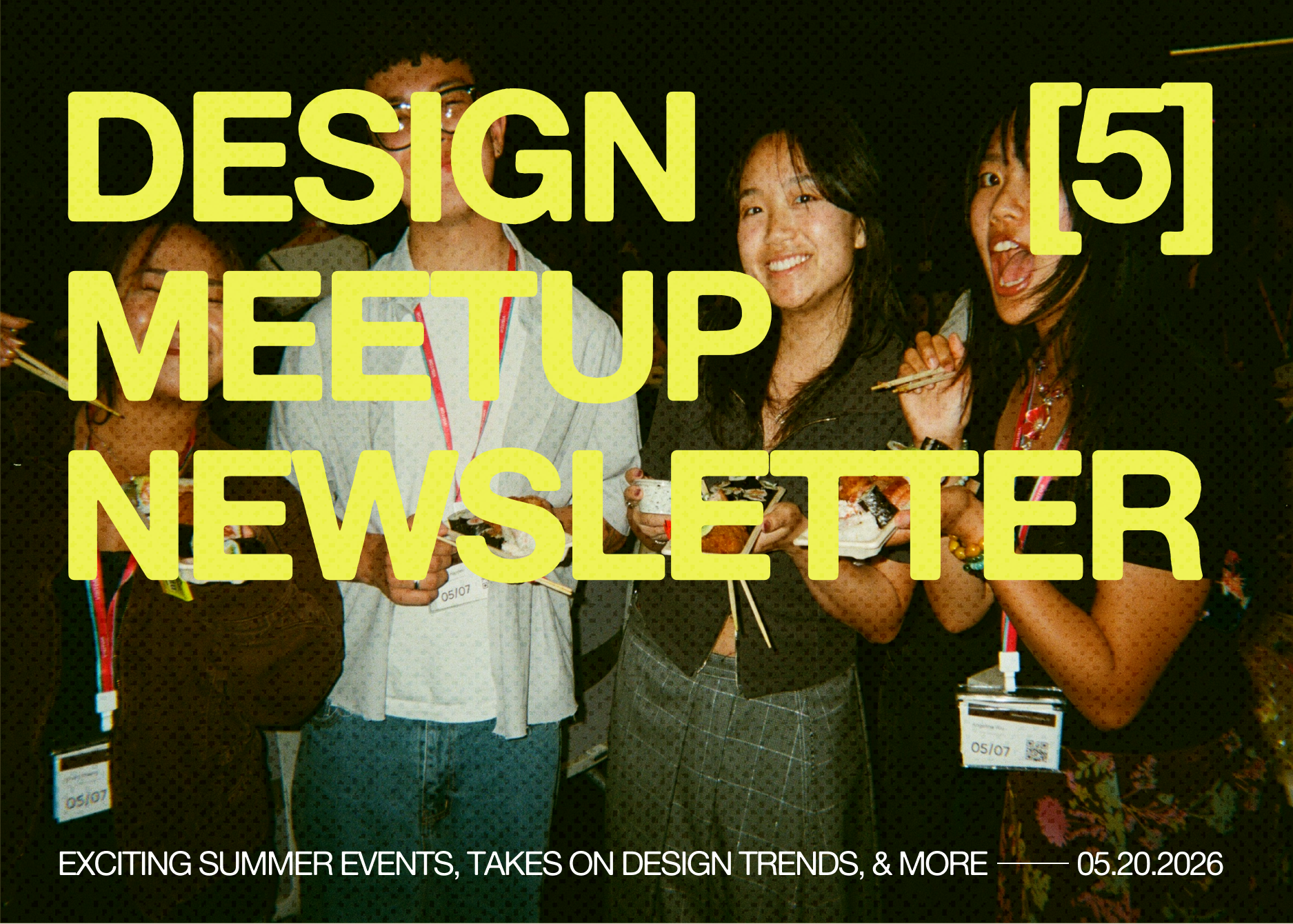
Welcome to our Vol 5 of Design Meetup’s Newsletter! We’re so excited that you’re back :)
📸 Snapshots of past events
Design Meetup x Tiktok LA


Shoutout Michelle Liu and the UCLA Figma Campus Leaders for kicking off our LA events and hosting such a fun event!
📅 What’s coming up
Design Meetup x Ramp NYC (May 27, Luma)
We’re hosting our 3rd meetup at Ramp’s NYC office. Whether you’re a student or an early-to-mid career designer, this event is designed to help you navigate the distinct paths of the design world—In-House, Agency, and Independent.
Through a series of lightning presentations and an open panel, we will move beyond the portfolio to unpack the personal resilience, hard truths, and identity shifts required to sustain a long-term creative career.
Design Meetup x Notion NYC (May 29, Luma)
Join us for an inside look at how designers at Notion actually work behind the scenes. In this panel, Notion designers will share the tools they rely on day to day, how their process have evolved over time, and how designers can approach new challenges in their work. After the panel, we’ll open the room for a live Q&A, followed by informal chatting with fellow designers and attendees.
Reve, Figma, Google, and more…
🦄 Opportunities
These jobs were posted in the past 2 days, so they’re still fresh!
Internships
Gulfstream Aerospace Fall 2026 UX Designer Collegiate Associate Intern
Honda Creative Design and Research Co-op/Intern - Spring 2027
New grad roles
🎨 Takes on Design Trends
From Brandon and Ilyssa
Lately we’ve been keeping a running list of design trends we notice cycling back into the feed. In an AI-slop world, we find these styles are each pulling from somewhere old, which is what makes them alluring. These are the three we’ve been thinking about:
Interface Nostalgia / Desktop Core
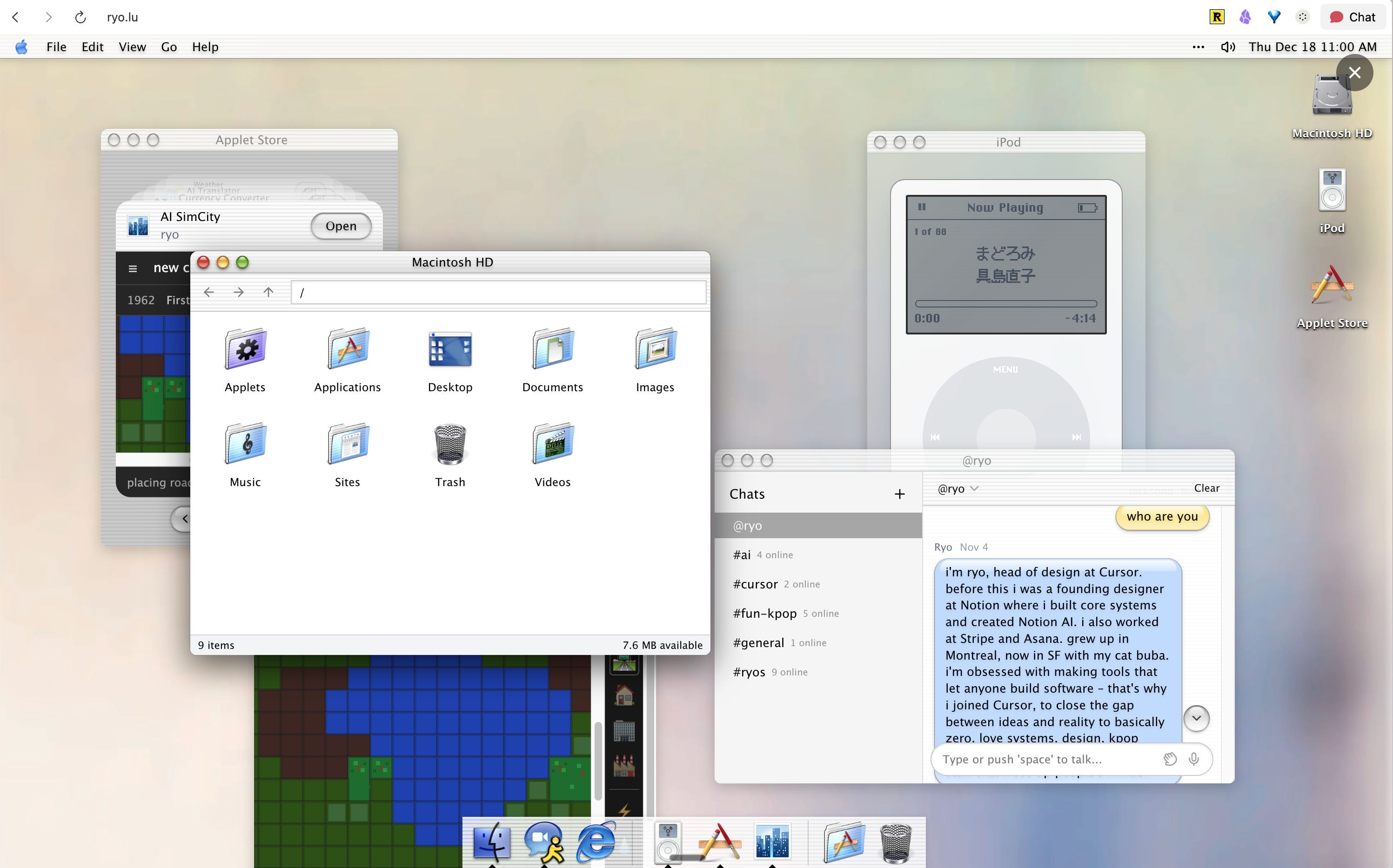
Source: https://ryo.lu/
Frutiger Aero is everywhere again. The frosted glass, the aqua gradients, the dew on the leaves, and Windows Vista in all its translucence. It had a four-year run before flat design buried it, and now, fifteen years later, it’s back again. What’s more interesting than the nostalgia though is the path it took to get here.
Another trend is what’s happening with Desktop Core, which is when designers use interface elements (windows, cursors, file folder structures) as actual compositional material. The metaphor is that an interface was always organizing thought in the first place, so why not use those elements to do that explicitly. It’s everywhere: on zine covers, in book design, in exhibition graphics, and portfolio’s like Ryo Lu’s. It’s a different use of the visual vocabulary of nostalgia, which is more about returning to a moment.
ASCII as Visual Texture (。◕‿‿◕。)

The ASCII trend has been fun to experiment with. The literal definition of ASCII is pictures made of letters. We see it more as a type and delightful texture. It creates tension and dimension: overlaying photography, underneath a layout as a textural field, as an interactive element like in Emmi Wu’s portfolio. It breaks things up similarly to how a halftone breaks up a printed photo.
There’s also something interesting happening where ASCII art and risograph printing are starting to feel like the same thing, even though they look totally different. Both of them work inside really strict rules. Risograph printers can only use certain colors and print in a certain way. ASCII art can only use keyboard characters on a grid. But instead of fighting those limits, artists are finding what looks cool because of them.
Some design studios are treating the character grid not as a throwback to old computers, but just as the rules of the game. A chessboard is an 8x8 grid. Nobody looks at chess and thinks "wow, retro." The grid is just... how chess works. These designers are treating ASCII the same way, the grid isn't a costume or a style choice, it's just the material they're working with.
A lot of design tries to hide its process. But here, the fact that it was made on a grid, with constraints, is totally visible. The limitation isn't something to be embarrassed about, it's basically the whole point.
Imagery From Nature
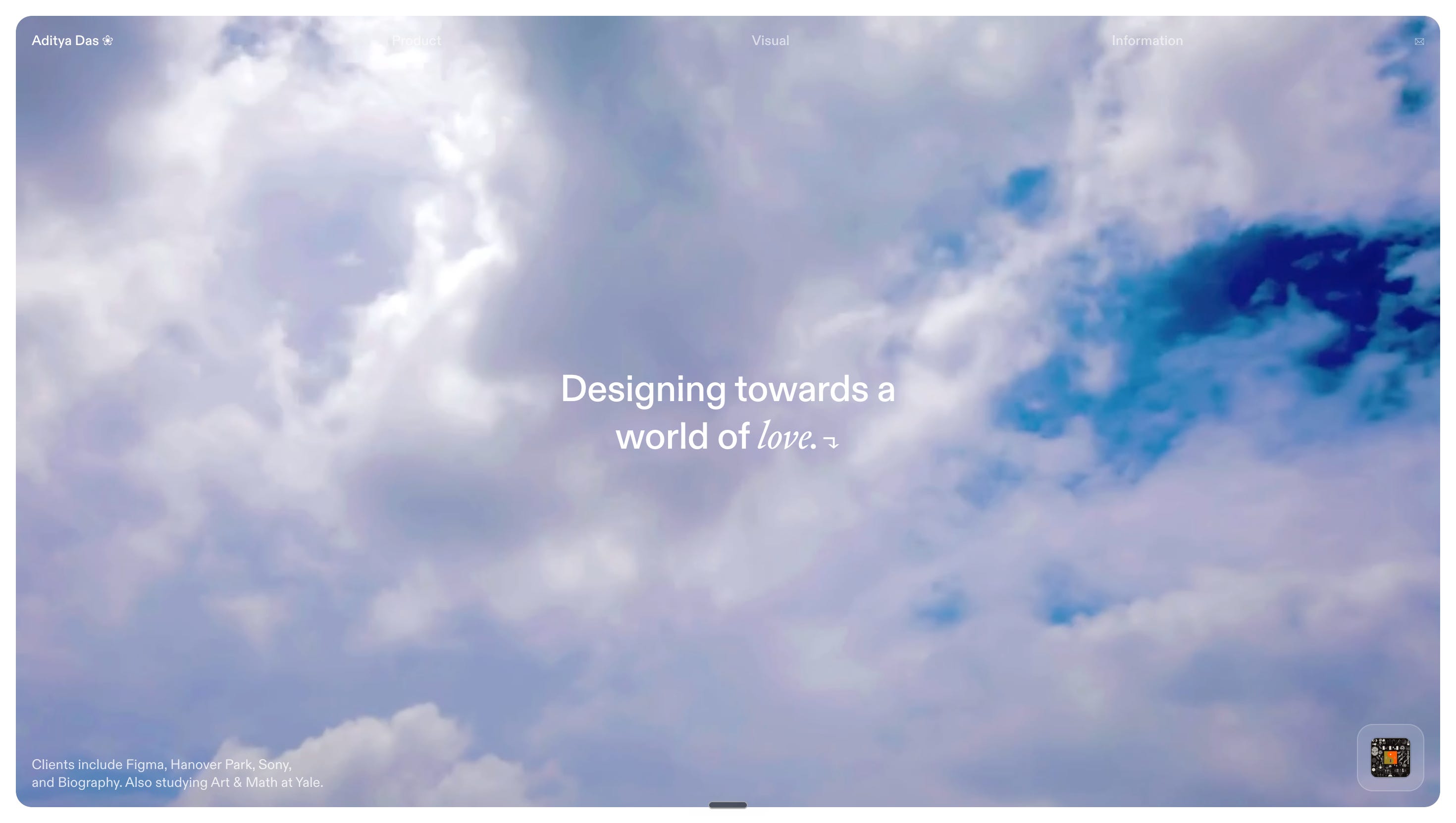
Source: https://adityad.as/
For most of its history, technology has looked deliberately sterile. Think clean lines, cold surfaces — as if the natural world had been intentionally removed from the equation.
Including imagery from nature today is a pushback against that. The trend integrates botanical illustrations into circuit-board geometry, adds breath and human warmth to plain machines and robots. Soft Baroque has been working in this space for years, creating objects that feel like they evolved rather than were engineered. But the trend has spread well beyond any single studio. You see it in interfaces using plants, sun, foods, and scenery as motifs, and in portfolios using photography and video of natural scapes as focal points, like Aditya Das’s portfolio.
The deeper question this trend is asking is: as humans, what do we actually want technology to feel like? Something tangled up in nature, rather than separate from it? Or, something that’s taken over us? We don’t want a tool that’s a tyrant against us, but one that understands us. If it looks like it grew, if it breathes, and carries the imperfection of the natural world inside it, maybe we can trust it a little more.
Design trends sometimes resurface because they’re saying something the present doesn’t yet have words for. The visuals, color palettes, and fonts are all interesting. But the argument underneath, about control, intimacy, what we want from the systems we build, is the part most worth paying attention to.
🔍 Designer spotlight: Bao To

Favorite design tool right now?
Superset.sh and Conductor.build
Where do you draw your inspiration from as a designer?
Mass consumption of media and culture aka being terminally online (tiktok, reels, x, pinterest, facebook).
What advice to early career designers do you have?
Trust your instincts and do what you think is right! you don’t need to have a linear path for your career, and always chase asymmetric upsides!
Fill out this form if you’re interested in being featured in one of our next volumes.
🎨 Design Twitter roundup


See you soon,
Ilyssa + Brandon